

In today's fast-paced digital world, a brand's online presence is often its first impression. Whether you're a burgeoning startup or an established enterprise, ensuring that your website is accessible, attractive, and functional across all devices is paramount. This is where responsive web design (RWD) becomes a game-changer. But what exactly is RWD, and why is it crucial for your brand's success? Let’s dive in.
What is Responsive Web Design?
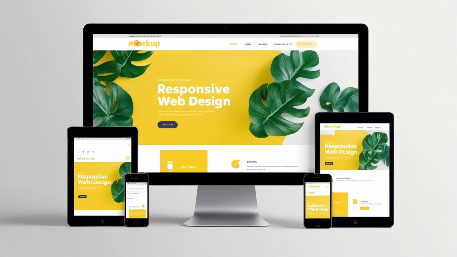
Responsive web design is an approach to creating websites that automatically adjust their layout, content, and functionality to suit the device being used. Whether someone is visiting your site on a smartphone, tablet, laptop, or desktop, a responsive design ensures that they have an optimal viewing experience. This adaptability is achieved through a mix of flexible grids and layouts, images, and the intelligent use of CSS media queries.
Why is Responsive Web Design Important?
- Enhanced User Experience Imagine a potential customer visiting your website on their smartphone. If they have to incessantly zoom in and out to read text or navigate through pages, their frustration could lead them straight to a competitor's site. Responsive design ensures that every user, regardless of their device, enjoys a seamless experience. This not only boosts customer satisfaction but also encourages longer site visits and higher engagement. According to a study by Sweor, 88% of users are less likely to return to a website after a bad experience.
- Improved SEO Rankings Google, the behemoth of search engines, rewards websites that offer excellent user experiences across all devices. A responsive design is a significant factor in Google's ranking algorithms. Google’s developer guidelines emphasize the importance of responsive web design for enhancing SEO. A responsive site has the advantage of being indexed more efficiently, which can improve your search engine rankings and increase your website's visibility.
- Cost and Time Efficiency Maintaining separate websites for mobile and desktop users was once standard practice, but it was also resource-intensive. With responsive design, you manage a single site that caters to all devices, significantly reducing development and maintenance costs. This unified approach also saves time, allowing your development team to focus on improving the site’s features and functionalities rather than juggling multiple platforms.
- Future-Proofing Your Website The digital landscape is ever-evolving, with new devices and screen sizes emerging regularly. Responsive design is inherently flexible, adapting to new technologies and ensuring that your website remains relevant and functional. By investing in a responsive design today, you're not only catering to current user needs but also safeguarding your site against future technological shifts. As noted in an article by Smashing Magazine, responsive design is a long-term solution for an ever-changing digital environment.
- Increased Conversion Rates A responsive website doesn't just attract visitors; it converts them into customers. By providing a consistent and accessible user experience, you reduce bounce rates and increase the likelihood of conversions. Whether it's a purchase, a signup, or an inquiry, a responsive design ensures that users can easily complete desired actions, regardless of the device they're using.
How to Implement Responsive Web Design
Implementing a responsive web design involves several key strategies:
- Flexible Grids and Layouts: Use a flexible grid system that adapts to different screen sizes. This allows content to shift and resize dynamically, maintaining visual harmony and readability.
- Responsive Images: Ensure that images scale appropriately and do not hinder page load times. Techniques such as CSS media queries and the
<picture>element in HTML5 can help manage image responsiveness. - Media Queries: CSS media queries enable you to apply different styles based on the device's characteristics, such as width, height, orientation, and resolution. This ensures that your site looks great on any device.
- Prioritize Performance: A responsive site should also be optimized for speed. This includes minimizing HTTP requests, compressing files, and leveraging browser caching.
Conclusion
In an era where digital interactions define customer relationships, a responsive web design is not just a nice-to-have; it’s a necessity. It enhances user experience, boosts SEO rankings, is cost-effective, and future-proofs your digital presence. As a web development agency, showcasing your expertise in responsive design can set you apart from the competition and attract discerning clients who understand the value of a superior online experience.
If you're ready to elevate your brand’s digital footprint and ensure your website is responsive, reach out to our team of experts. Let us help you create a site that not only meets but exceeds the expectations of your users.
Remember, in the digital world, first impressions are often last impressions. Make yours count with a responsive web design.